
Click the plus for more details
-
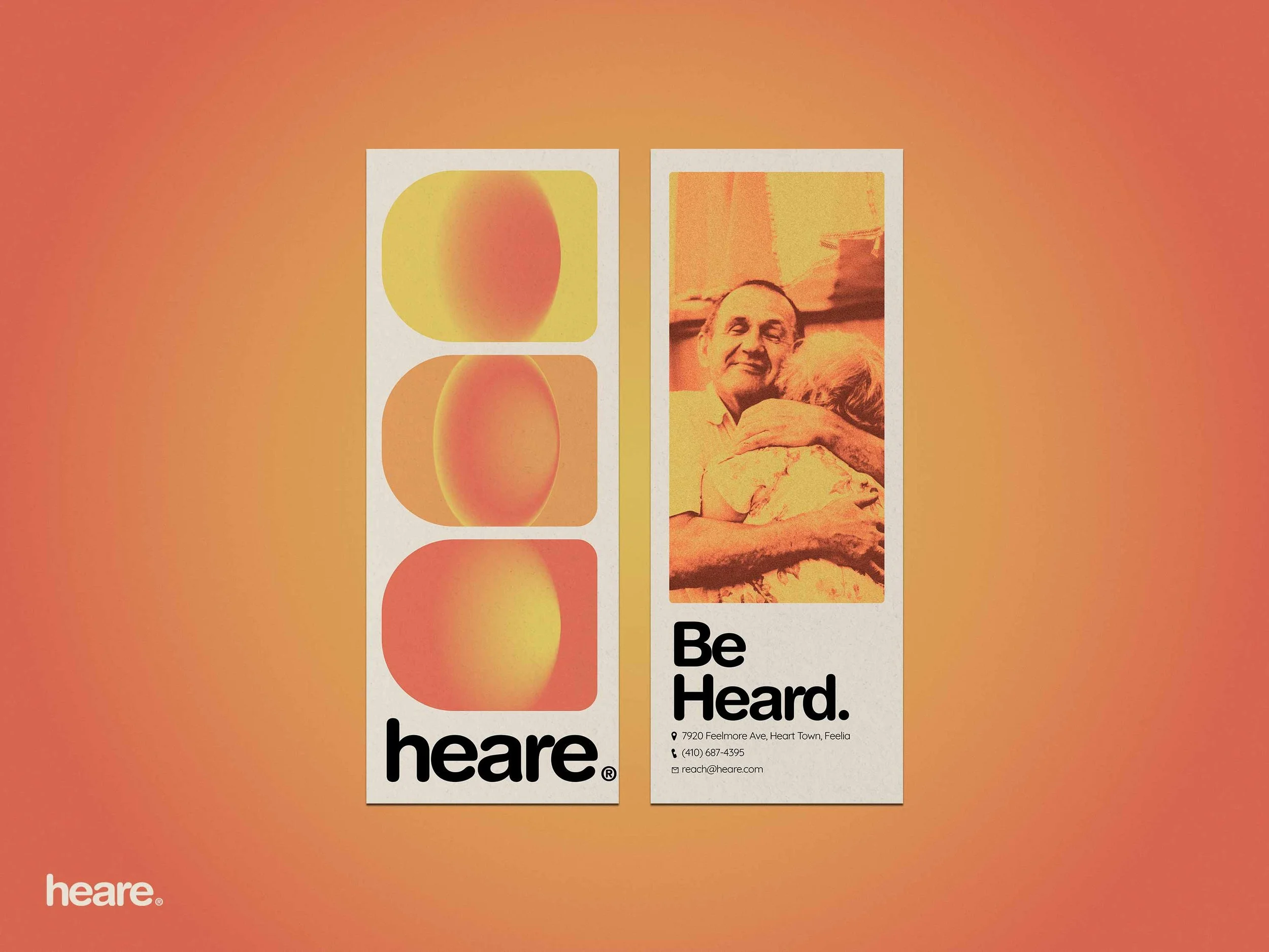
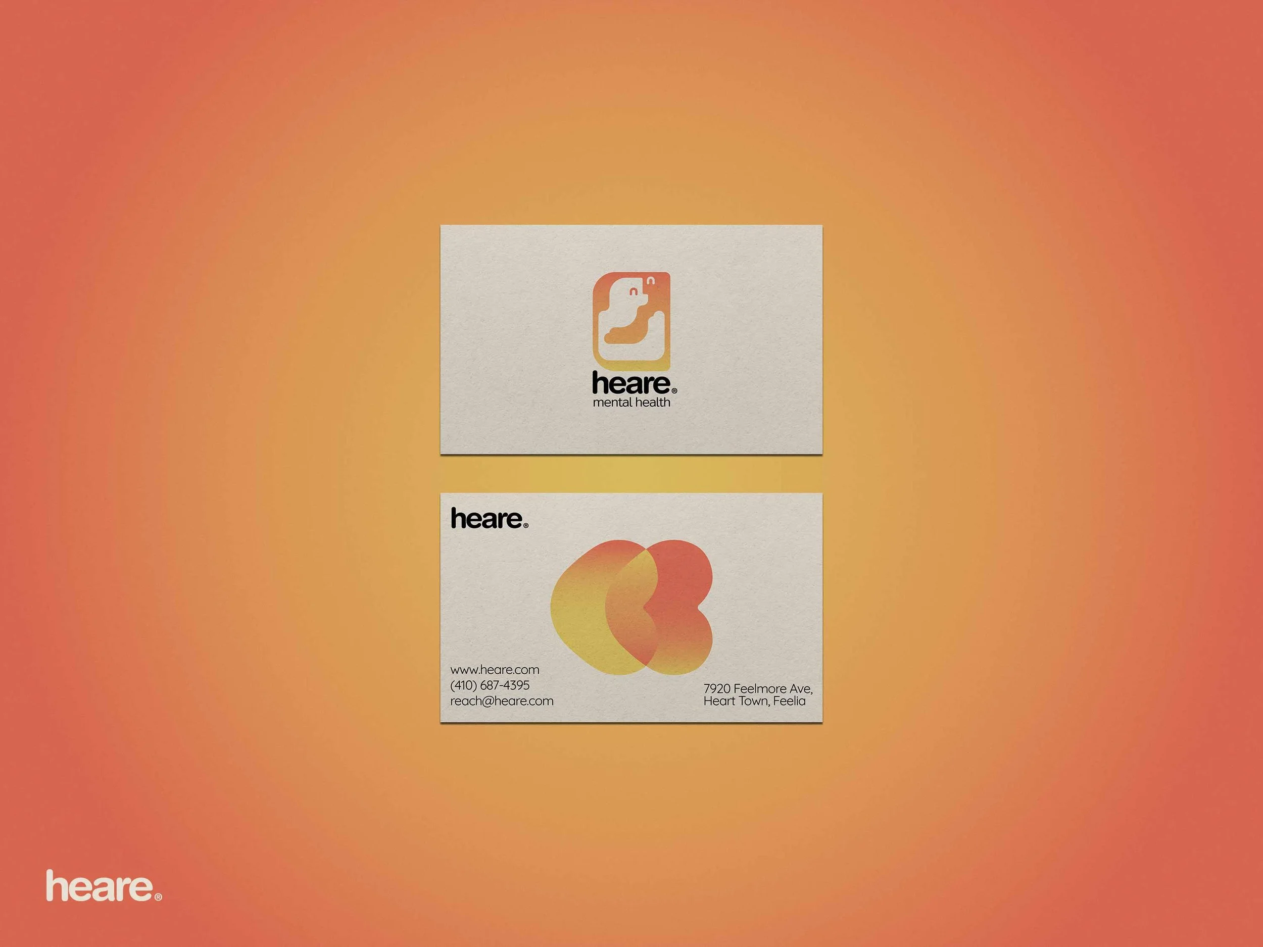
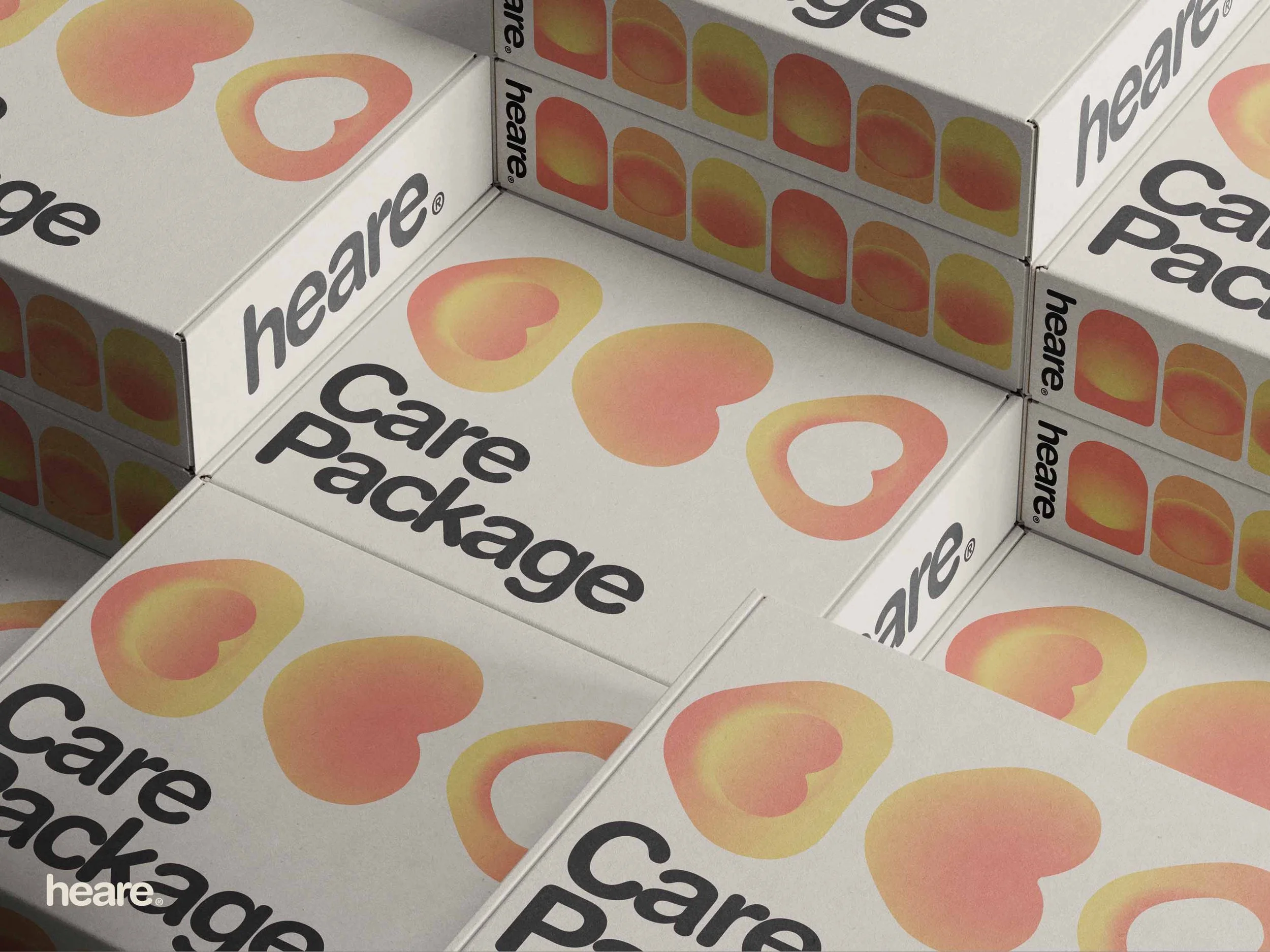
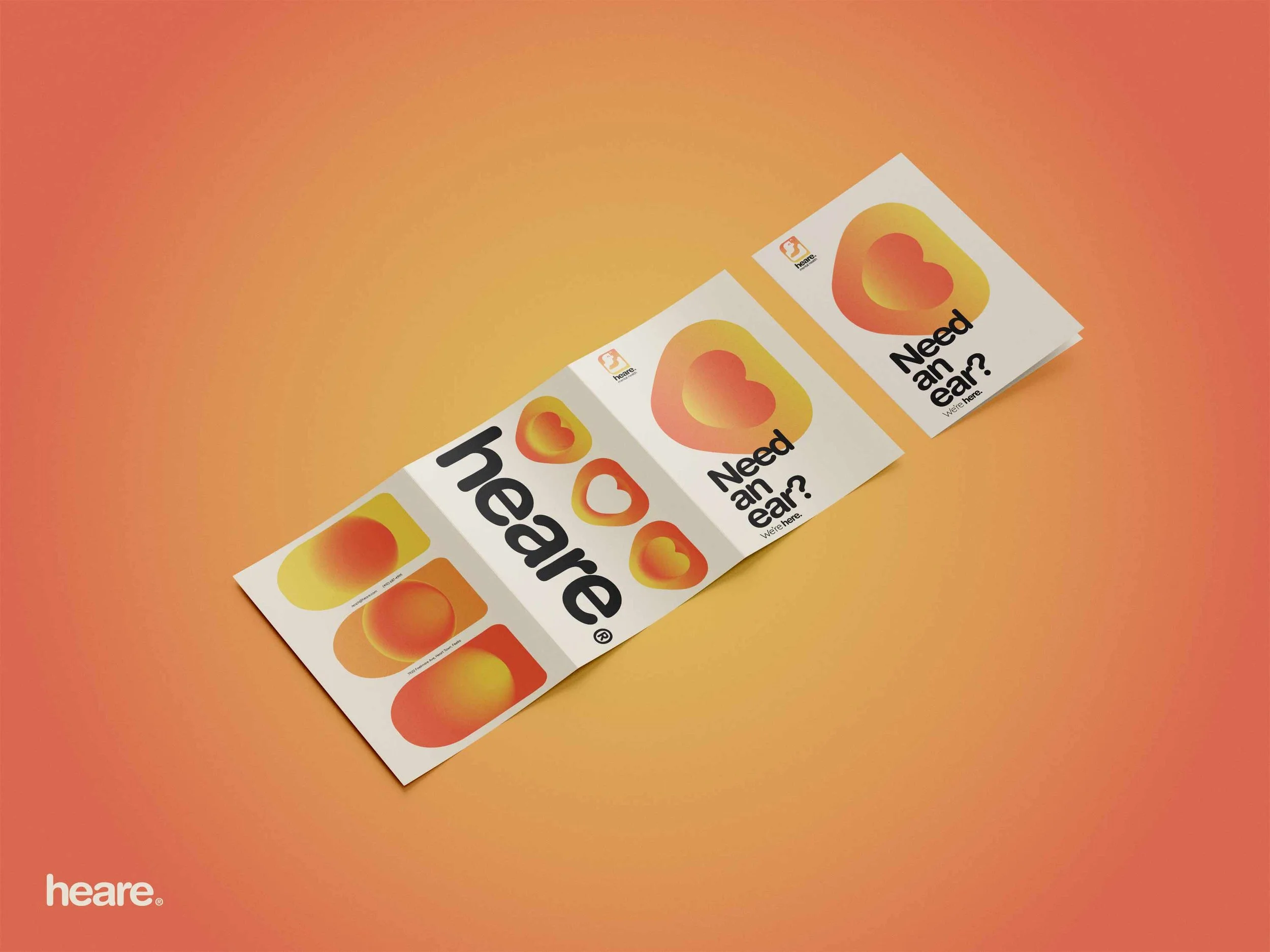
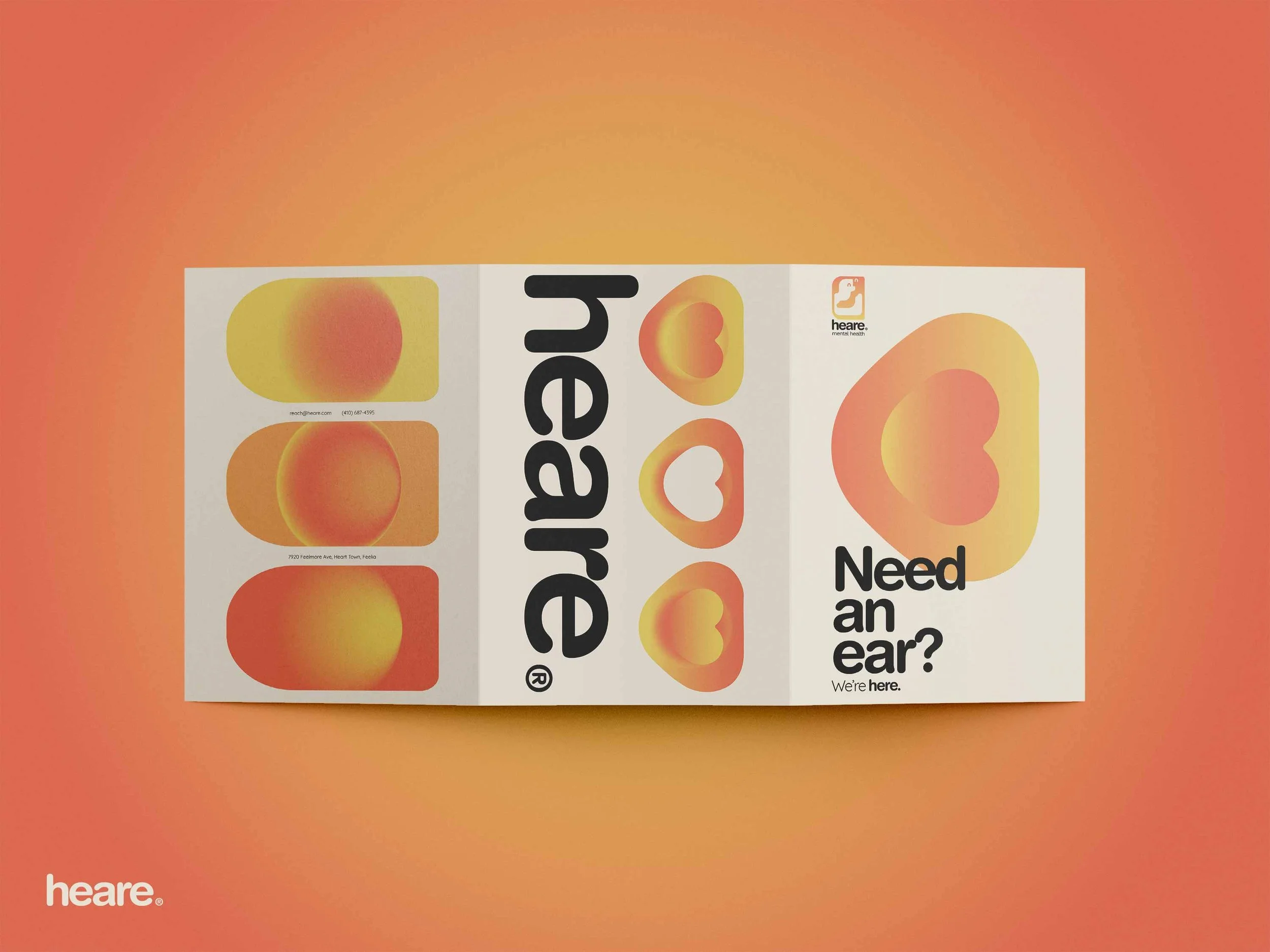
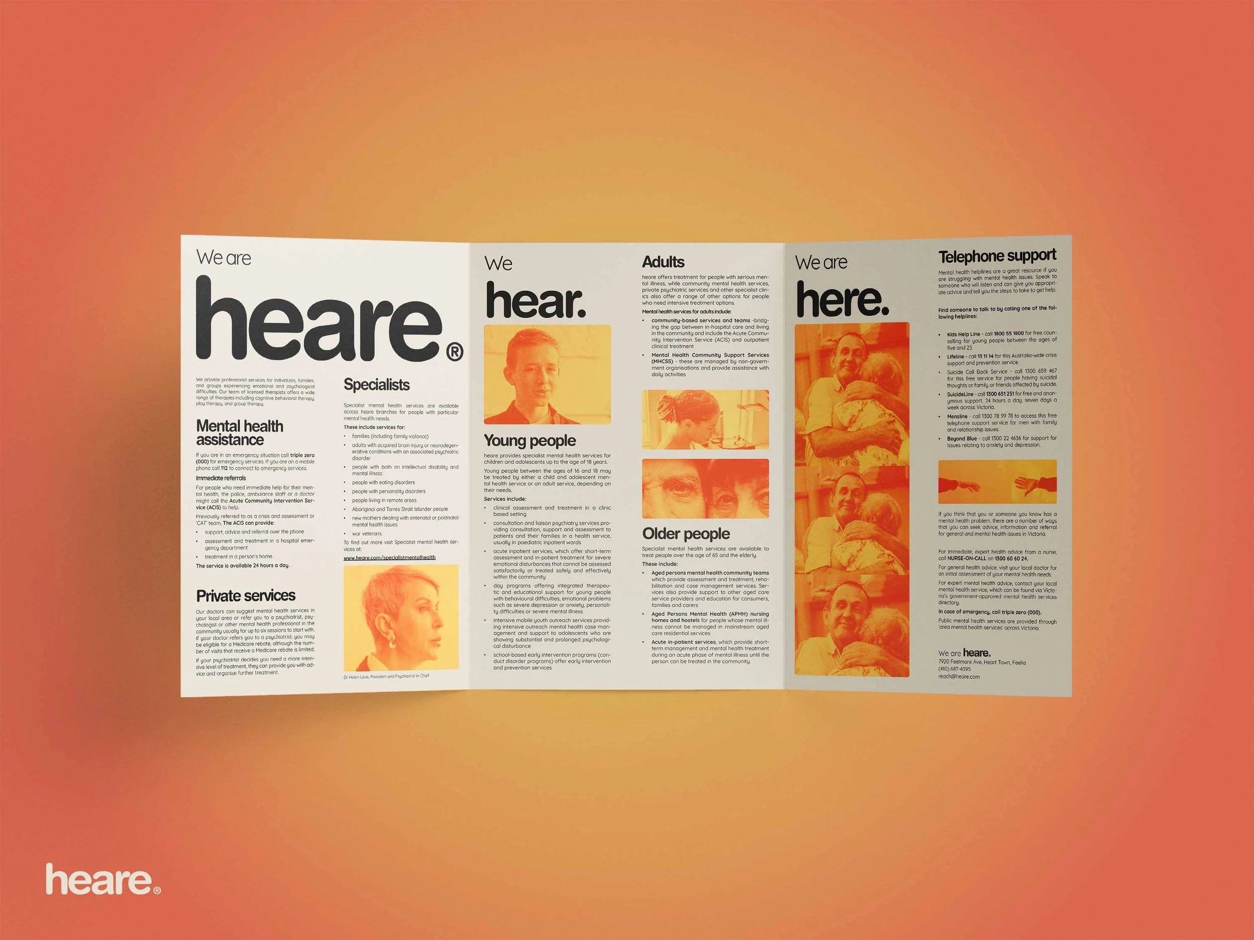
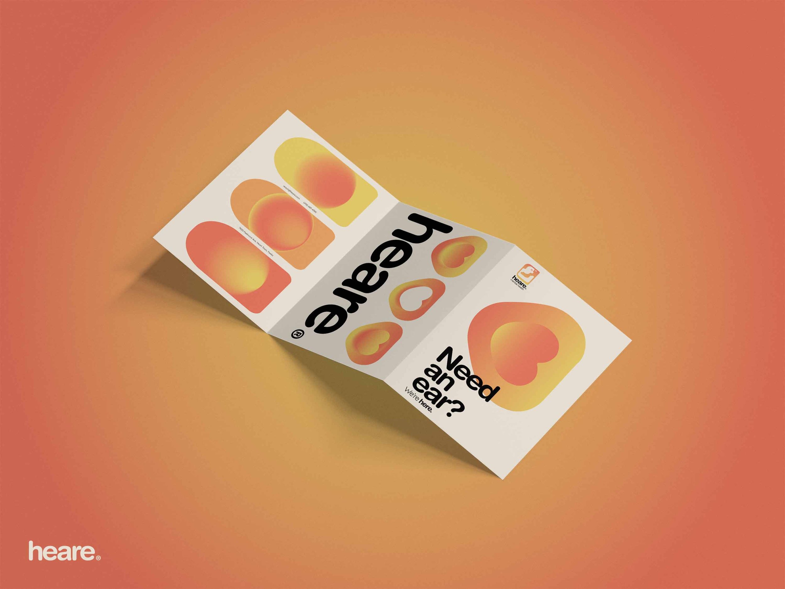
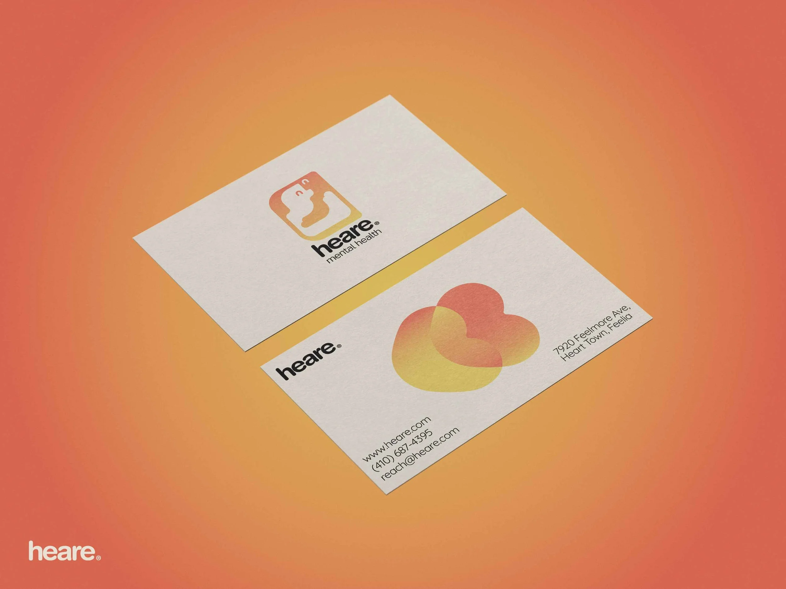
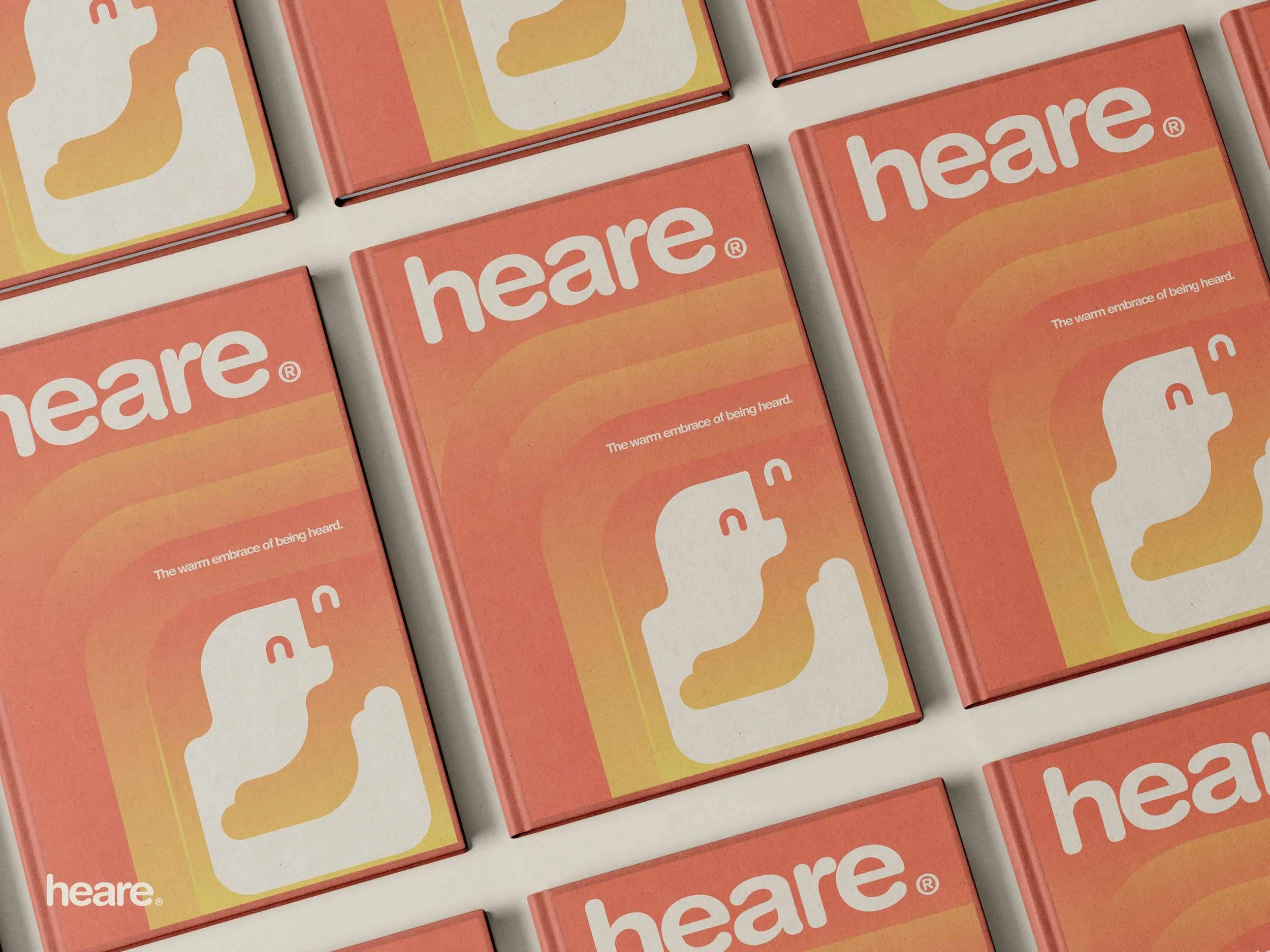
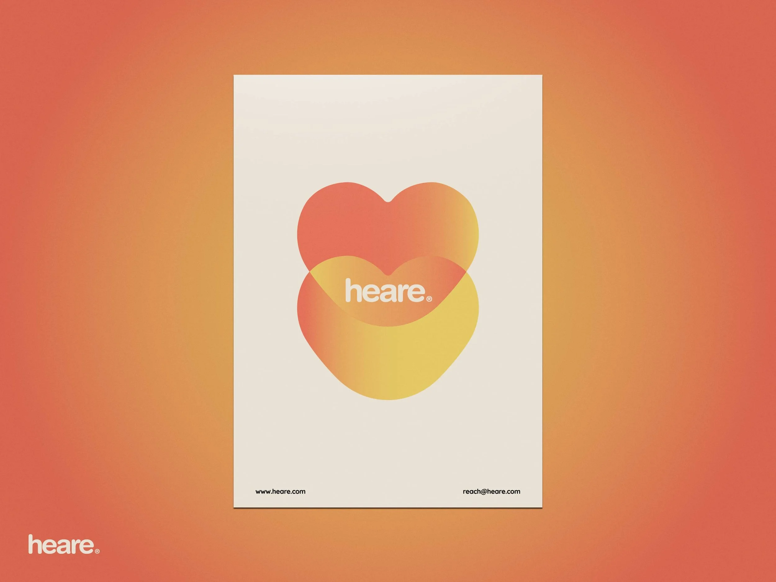
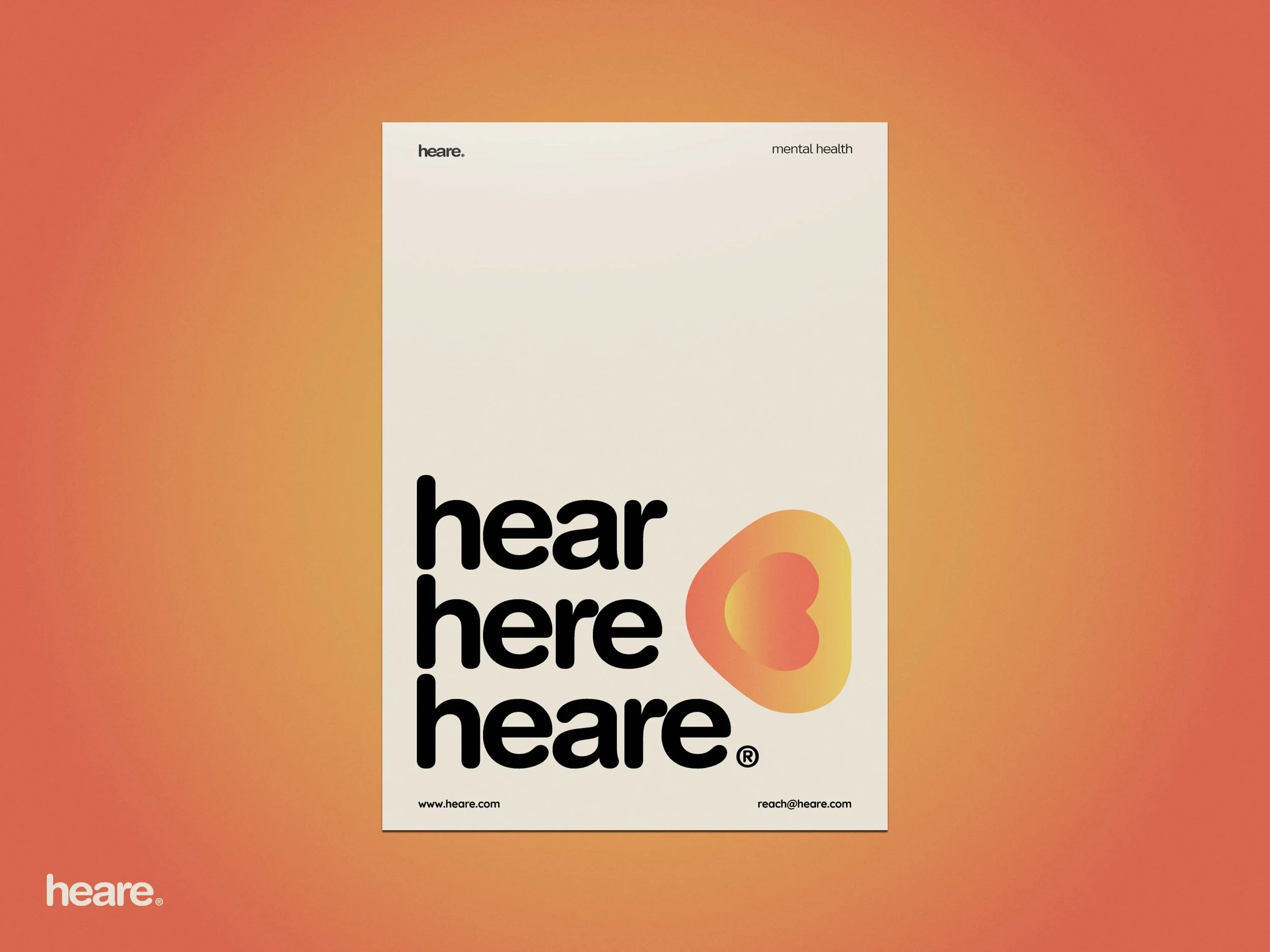
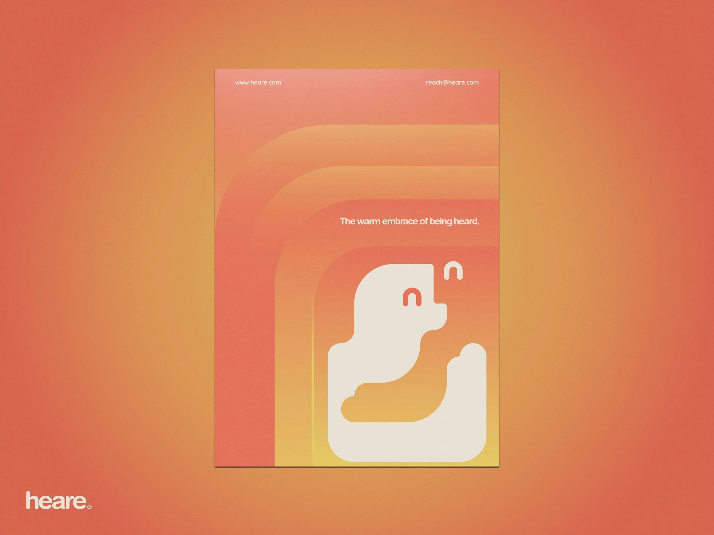
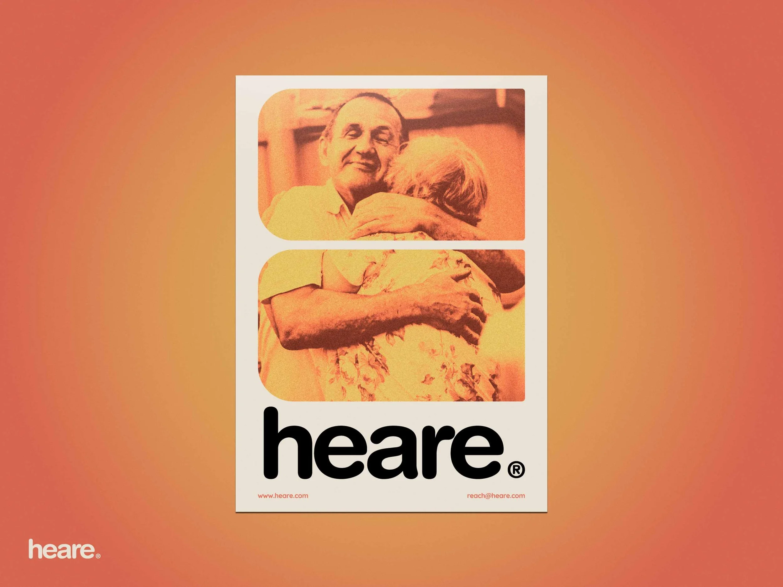
Brand Identity for a mental health center that focuses on two important aspects of mental health: being heard, and having good company.
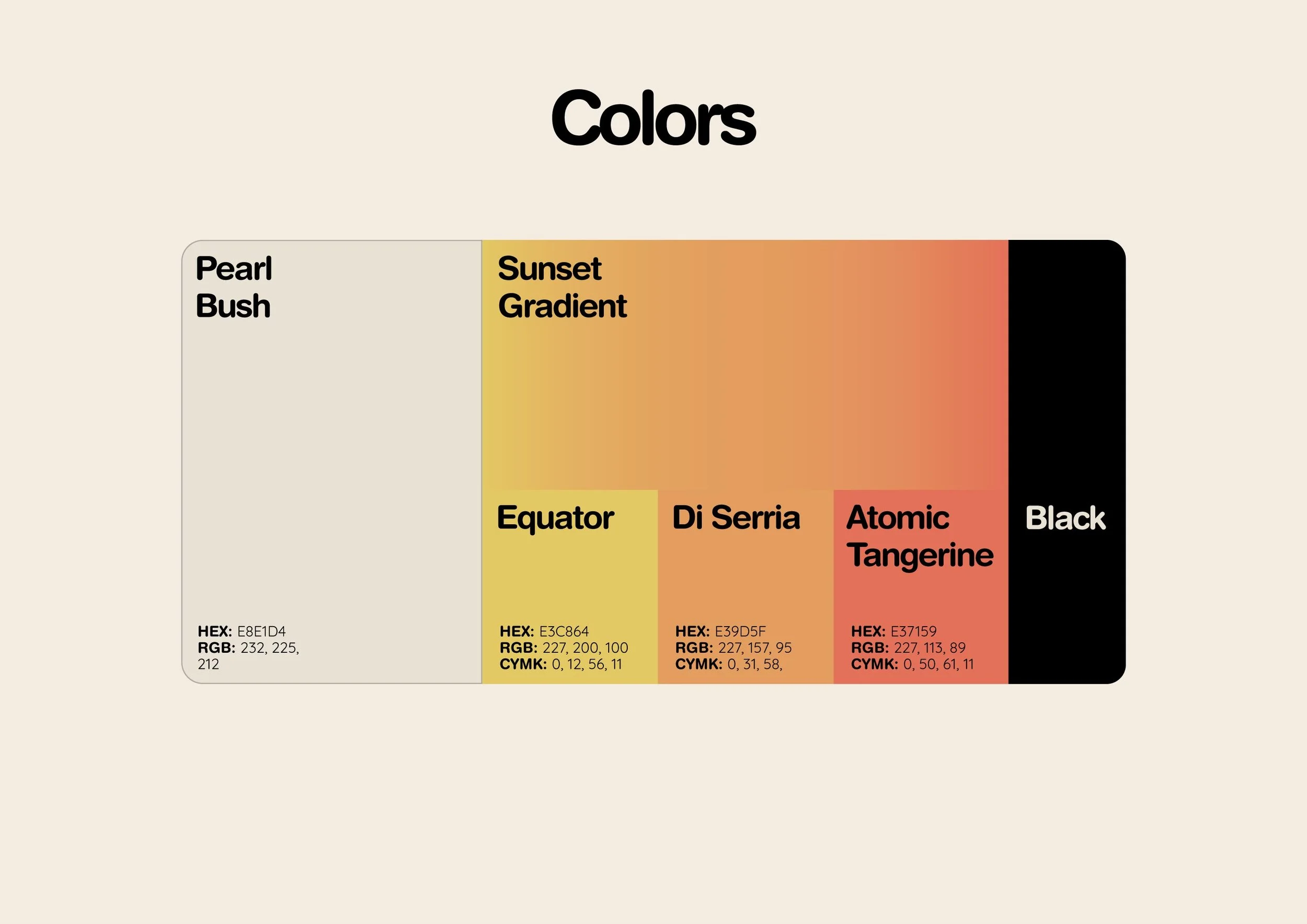
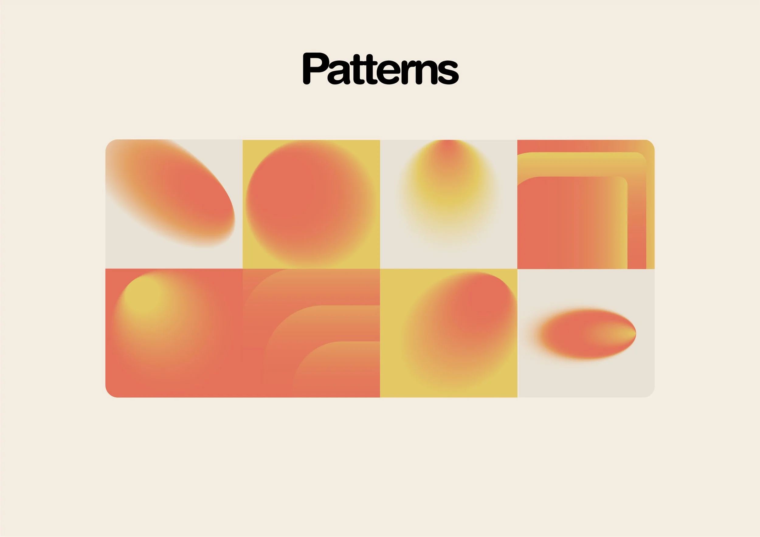
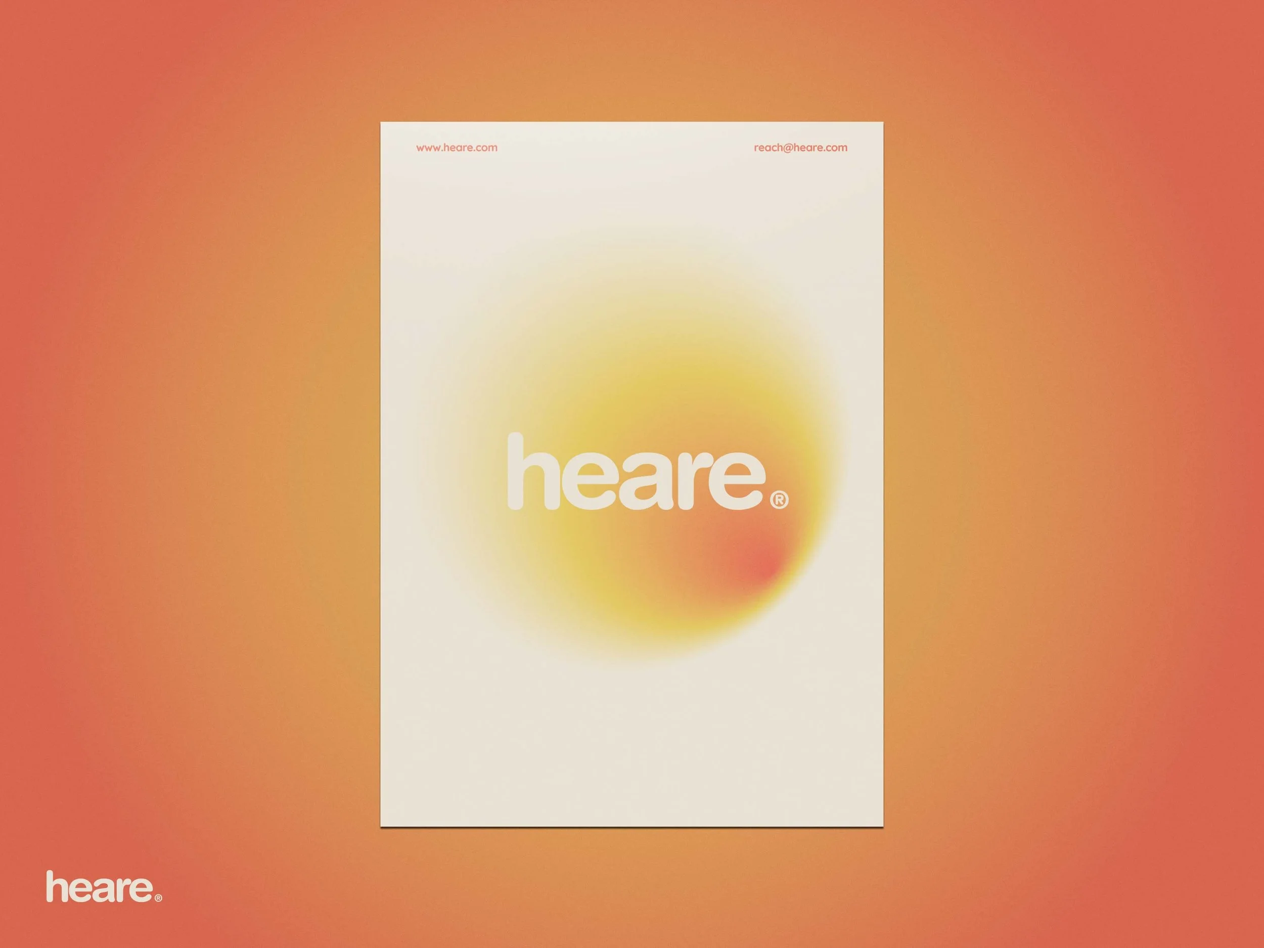
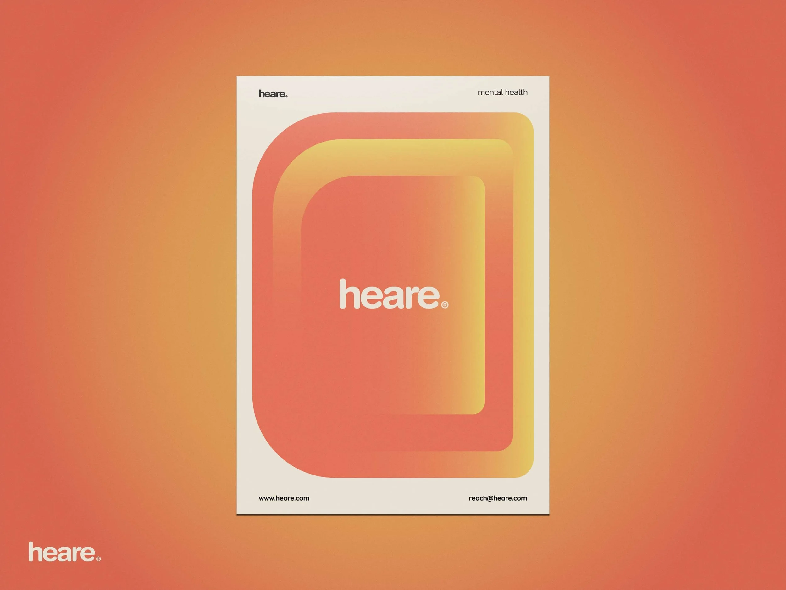
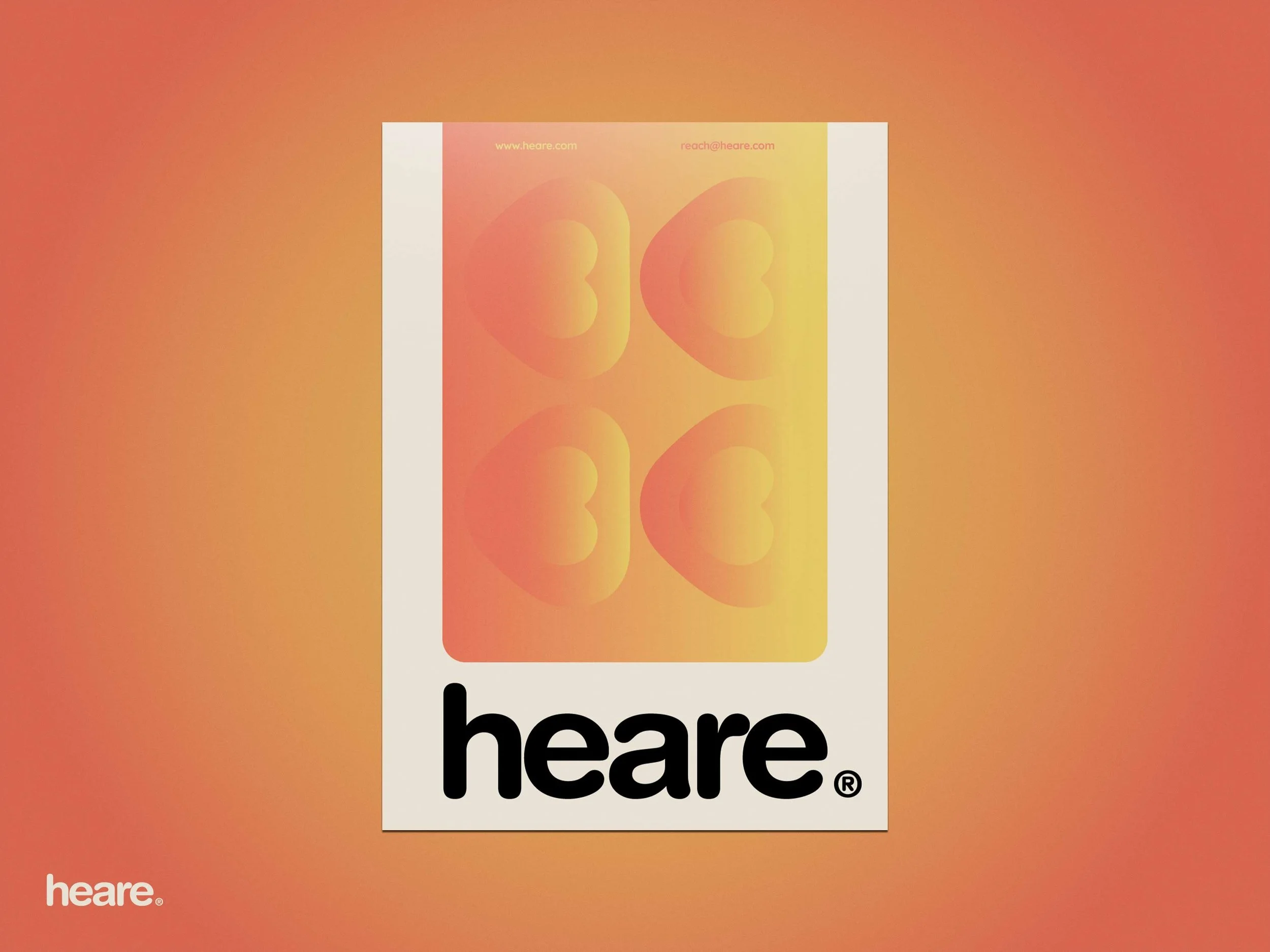
heare’s brand identity focuses on being minimal and smooth to offer an experience that is clear and easy on the eyes; the colors provide a sense warmth but they also signify energy and strength.
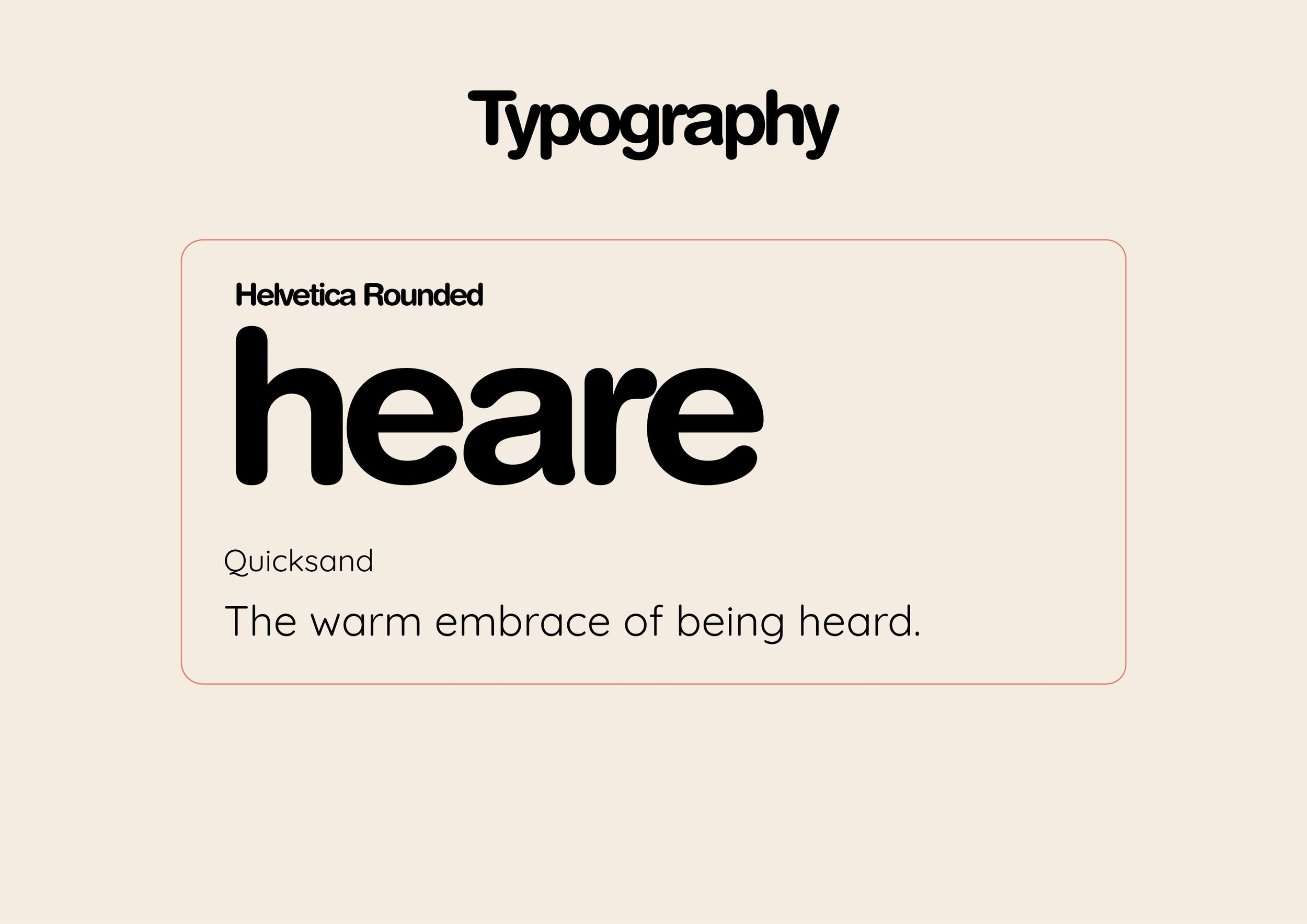
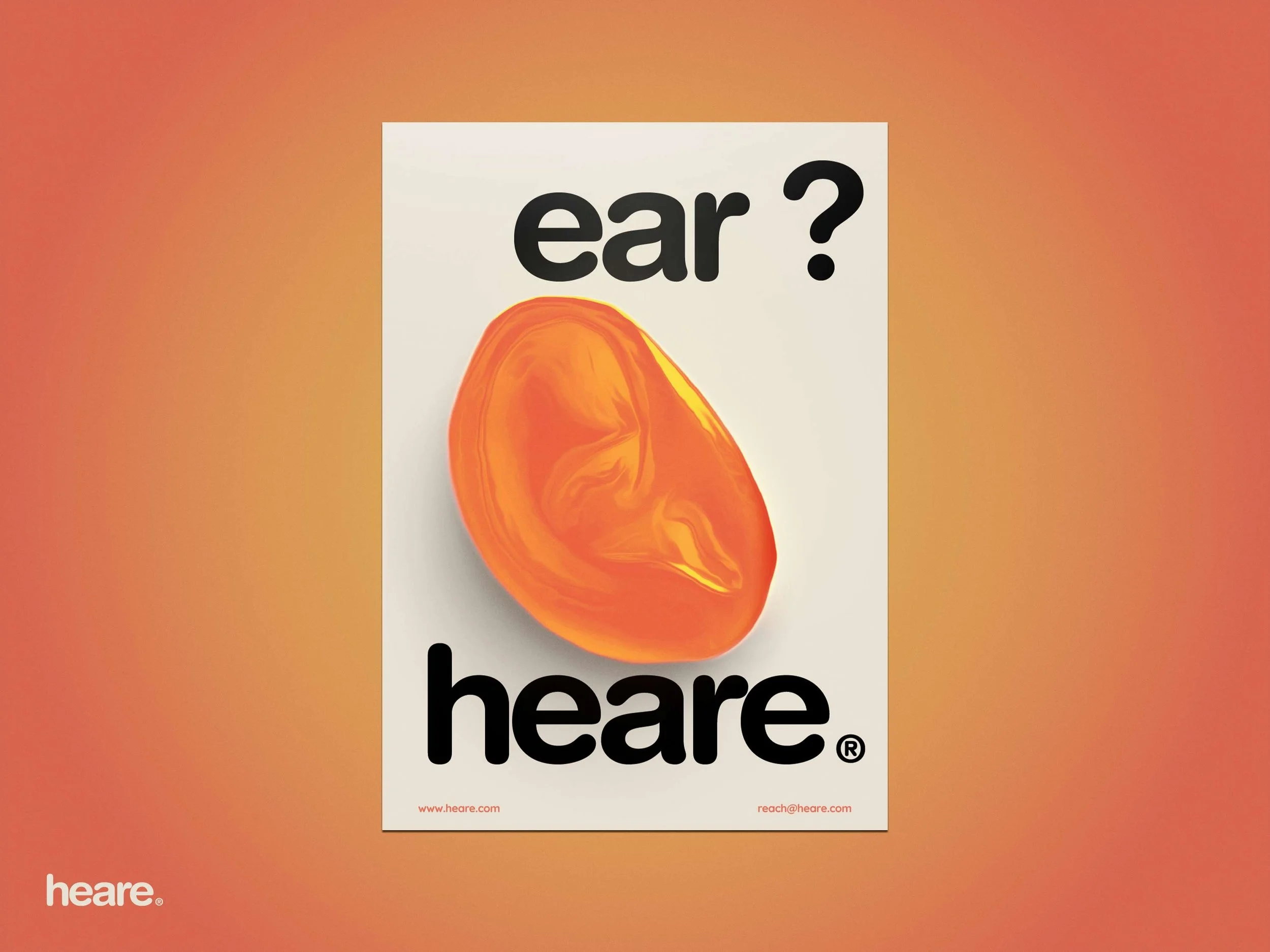
The name “heare” is a wordplay of the words “hear” and “here” and is pronounced the same as those two words.
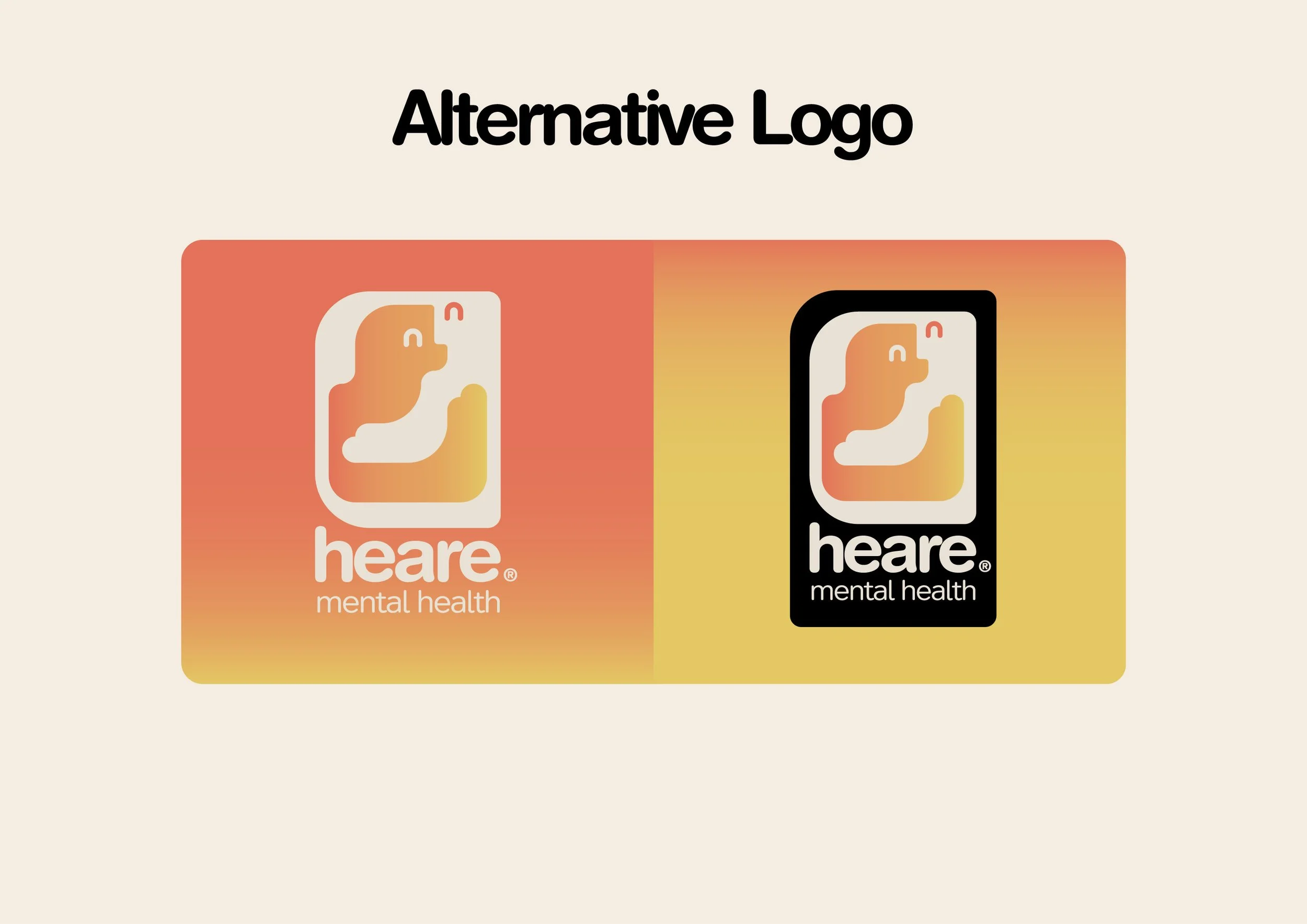
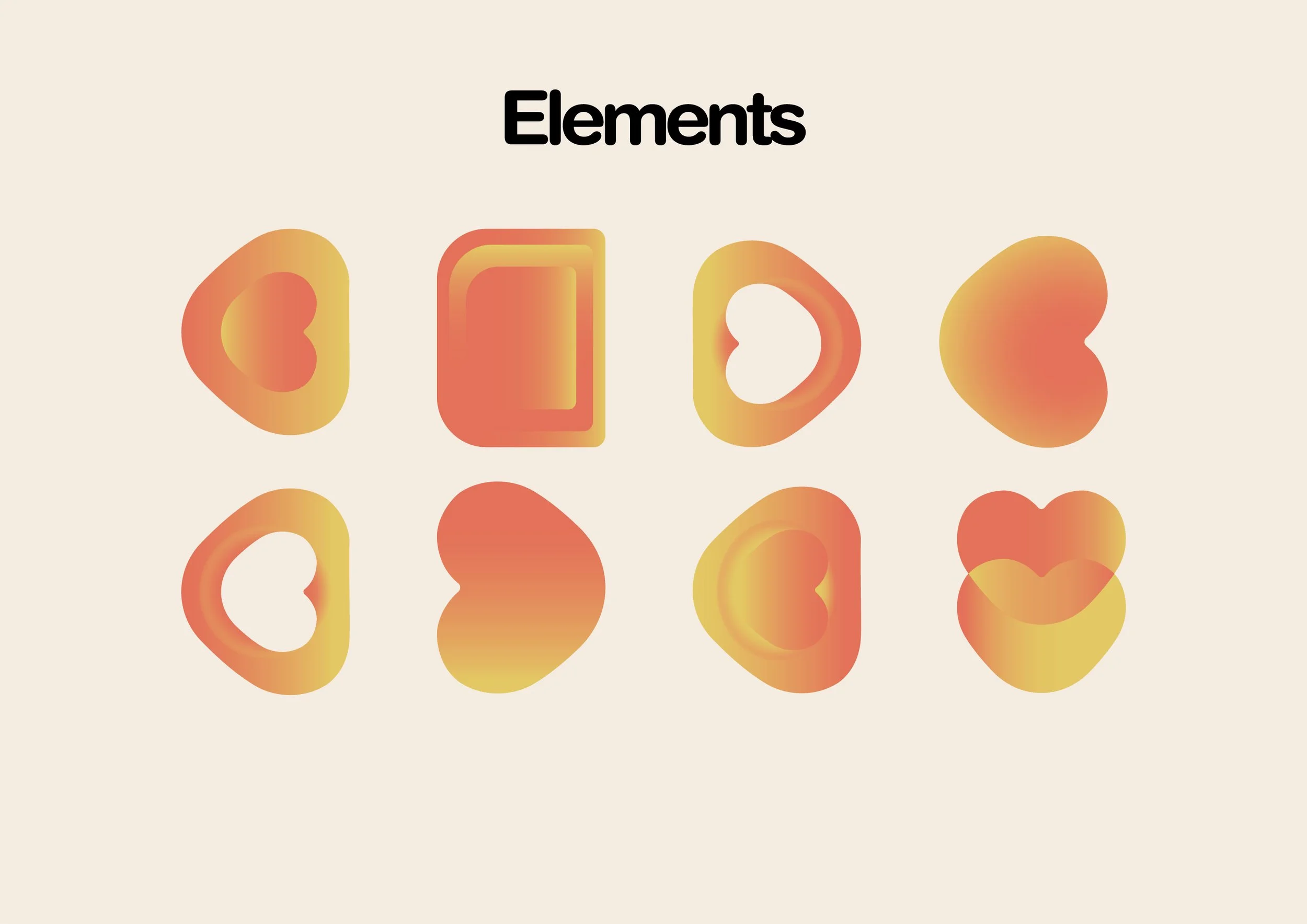
heare’s logo aims to give a sense of warmth and welcomeness, with a very minimal use of sharp edges, focusing more on looking round and smooth, to give a satisfying feel when seen which can also be seen in the printed goods like the posters and the brochure.
Client: heare (Concept)
Year: 2023
Branding, Logo Design, Promotional Video
-
camel Club is a café that nostalgically recreates the charm and vibrant vibes of the 80s. Designed with a warm and airy interior, it captures the unique spirit of an era cherished for its character and authenticity. The menu blends fusion Arabic dishes with comfort food classics, delivering a taste of tradition with a contemporary twist. Adding to the retro feel, the café offers a distinctive selection of cakes served in custom branded tins, a playful nod to the simple joys of the past, bringing the essence of 80s nostalgia into every experience.